Newspaper / Royal Academy Of Fine Arts
Conceptual design for a 3-monthly newspaper.


Ap-Art is a 3-monthly newspaper of the Royal Academy of Fine Arts Antwerp.
The school merged with other schools and the fusion name is AP - so as a logo I designed AP/ART.
In dutch, ‘apart’ means ‘different’, and at the same time ap/art referring to the art department. Referring how it is easy to spot the art students being/dressing/thinking a bit different than the other students.
I used fonts that are quite neutral as the aspect for news and let the content speak for itself in all its diversity.
The aspect of time is shown with the paper wrapped in brown paper, leaving the print marks and bleed on the paper, using a typewriter to date and put together with a sewing machine.
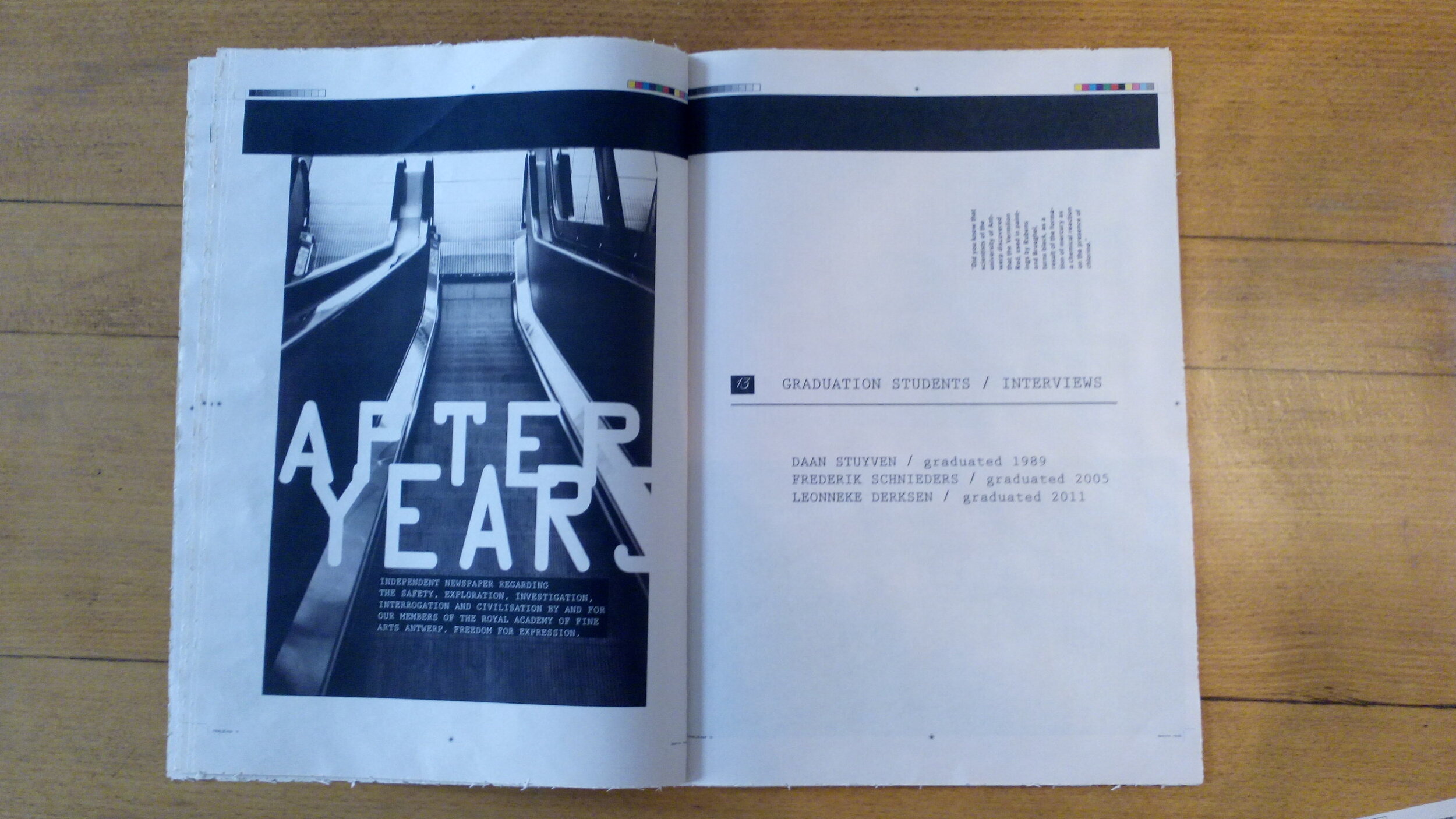
The structure has a reoccurring system with the after years always turned on the side.
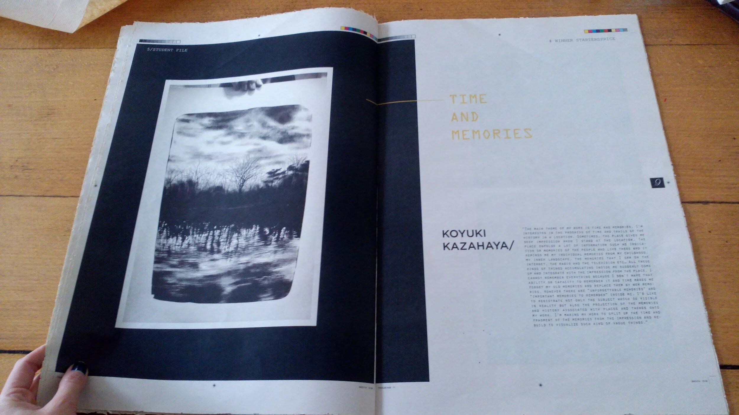
Enclosed you find a flyer with exhibitions, a photographic report of the MOMU and a collection item of a student.